Appearance
Styles
Styles control the visual appearance of the LIQA interface. Use style customization when your client application needs LIQA to match brand colors, typography, button treatments, or iconography without changing the capture logic.
Use this page when you need to:
- make LIQA feel native inside an ecommerce, diagnostic, loyalty, or consultation flow;
- align buttons, backgrounds, and type with brand guidelines;
- adapt selected screens for campaign or market-specific design needs;
- keep customization limited to recommended selectors so the capture experience remains stable.
On this page:
- Use API Usage to learn how to pass custom CSS through the
stylesAPI. - Use Common Styling Cases for common brand customization examples.
- Use Recommended CSS Selectors and DevTools inspection to find production-safe UI anchors.
- Avoid Restricted CSS Selectors to prevent breaking the end-user experience.
API Usage
After deciding which UI elements should be branded, use the styles attribute of the <hautai-liqa /> element and provide the CSS rules via one of the 2 options below.
TIP
If any property for any UI elements is left empty, the default property value for this UI element will be used.
Option 1: Provide Inline CSS styles
The styles attribute accepts a string containing valid CSS rules:
tsx
tsx<hautai-liqa license ="LICENSE_KEY_PROVIDED_BY_HAUT.AI"styles =":host { --background-color: 51 51 51; }" ></hautai-liqa >
tsx<hautai-liqa license ="LICENSE_KEY_PROVIDED_BY_HAUT.AI"styles =":host { --background-color: 51 51 51; }" ></hautai-liqa >
Option 2: Provide External CSS file
The @import CSS at-rule can be used to load the styles from an external file:
tsx
tsx<hautai-liqa license ="LICENSE_KEY_PROVIDED_BY_HAUT.AI"styles ="@import('path/to/custom-liqa-style.css')" ></hautai-liqa >
tsx<hautai-liqa license ="LICENSE_KEY_PROVIDED_BY_HAUT.AI"styles ="@import('path/to/custom-liqa-style.css')" ></hautai-liqa >
Common Styling Cases
Start with these common styling scenarios when translating brand requirements into CSS:
- Set custom fonts
- Set custom text size and color
- Set custom background color
- Set custom styles on buttons
- Set custom icons
Set custom fonts
css
@import url("https://fonts.googleapis.com/css2?family=Open+Sans:wght@300;400&display=swap");
@import url("https://fonts.googleapis.com/css2?family=Alegreya+Sans:wght@300;400&display=swap");

/** Example: Apply for the whole LIQA component */
:host {
  --font-family: "Open Sans", sans-serif;
}

/** Example: Apply for the selected screen title */
.video-error h2 {
  font-size: 1.75rem;
}

/**  Example: Apply for the selected screen object */
.live-video .guidance {
  font-family: "Alegreya Sans", sans-serif;
}Set custom text size and color
css
/** Example: Apply for the whole LIQA component */
:host {
  /* Default text color as R G B */
  --color: 51 51 51;
}

/** Example: Apply for the selected screen title */
.source-selection h2 {
  font-size: 1.75rem;
}

/** Example: Apply for the selected screen object */
.live-video {
  color: #ffffff;
}Set custom background color
css
/** Example: Apply for the whole LIQA component */
:host {
  /* Default background color as R G B */
  --background-color: 255 255 255;
}

/** Example: Apply for the selected screen */
.source-selection {
  background-color: #ffffff;
}Set custom styles on buttons
css
/** Primary button styles */
.button {
  border-radius: 6px;
  color: #ffffff;
  background-color: #2f63d9;
}
.button:hover {
  background-color: #1d51cc;
}
/** Primary button styles in disabled state */
.button.disabled {
  color: #555555;
  background-color: #ebebeb;
}

/** Secondary button styles */
.button.secondary {
  color: #333333;
  background-color: rgba(255, 255, 255, 0.2);
  border-color: #c3c3c3;
}
.button.secondary:hover {
  border-color: #a9a9a9;
}
/** Secondary button styles in disabled state */
.button.secondary.disabled {
  color: #c3c3c3;
  background-color: rgba(255, 255, 255, 0.05);
  border-color: #ebebeb;
}Set custom icons
Using the Source Selection screen button‘s icon as an example.
css
/**
 * Glyph icon should be implemented as a monochrome SVG,
 * so it can adapt to the surrounding content‘s color (e.g. a button‘s text color).
 */

.source-selection .button .icon {
  mask-image: url("./path/to/custom-monochrome-icon.svg");
}css
/**
 * Colorful icon can be implemented as an image of any image format
 * supported by the browser (most common: svg, jpeg, png, webp).
 */

.source-selection .button .icon {
  mask: none;
  background: url("./path/to/custom-colorful-icon.png") center / cover no-repeat transparent;
}TIP
Icon selectors can be found in the Recommended CSS Selectors section of the page.
Implementation notes
The icons are implemented using the Pure CSS Icons approach. You can learn more about the approach from the Icons in Pure CSS blog post.
Recommended CSS Selectors
Use the selector list below when you need predictable, production-safe customization. These UI elements are distributed across LIQA screens and can be modified without a significant chance of breaking the end-user's experience. To explore the default styles of these UI elements, see the default styles section below.
Screen: Image Source Selection
This screen is displayed if the Image Sources are customized to allow users to upload photos, choose between camera sources, or continue through the Two-Device Flow. When Character Customization is enabled, the same Source Selection and companion QR-code anchors remain available in the character-based layout.
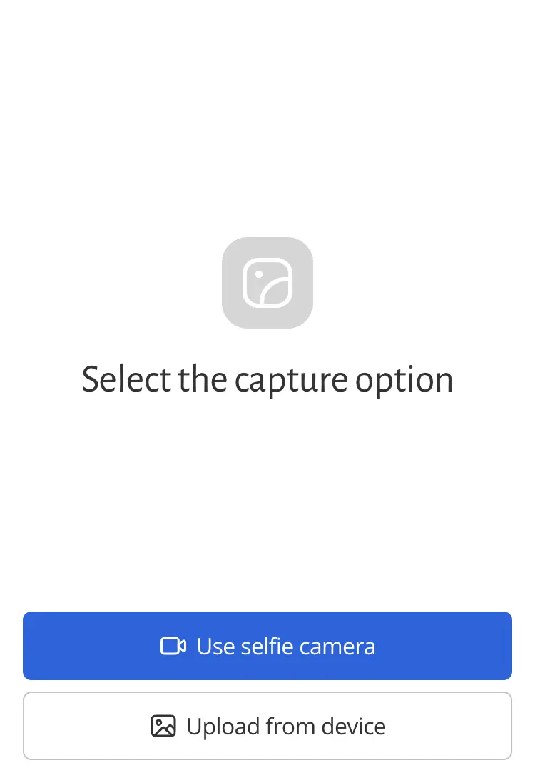
These CSS selectors can be used to safely customize the appearance of this screen:
css
/* Screen‘s class name */
.source-selection {}
/** Title ("Select the capture options") */
.source-selection h2 {}
/* Illustrative camera option icon */
.source-selection .icon-camera-lg {}
/* Illustrative upload option icon */
.source-selection .icon-upload-lg {}
/* Camera access denied icon (shown when user clicked "Use camera" but then denied the access) */
.source-selection .icon-camera-access-denied {}
/* Primary button */
.source-selection .button {}
/* Primary button icon */
.source-selection .button .icon {}
/* Secondary button */
.source-selection .button.secondary {}
/* Secondary button icon */
.source-selection .button.secondary .icon {}Screen: Companion (2-device flow)
These selectors apply to desktop and mobile screens used by the Two-Device Flow.
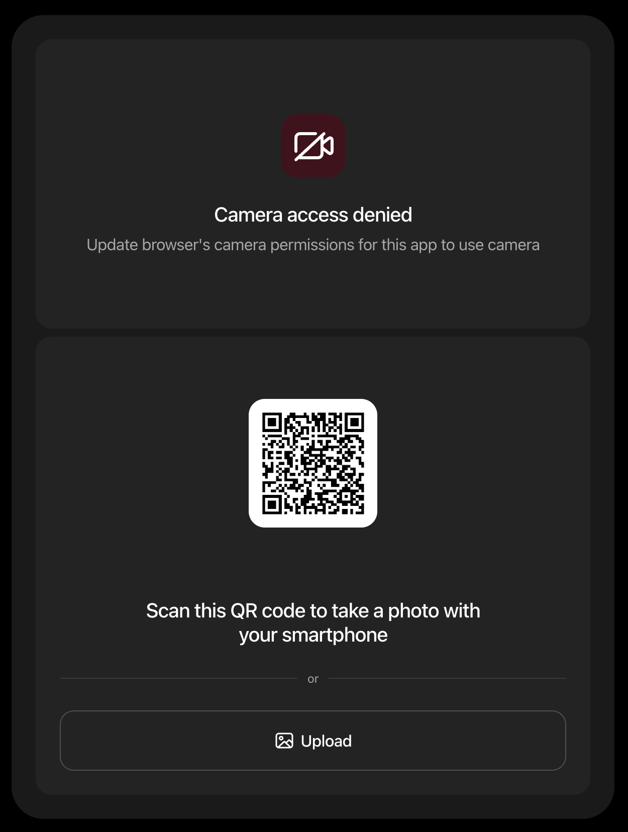
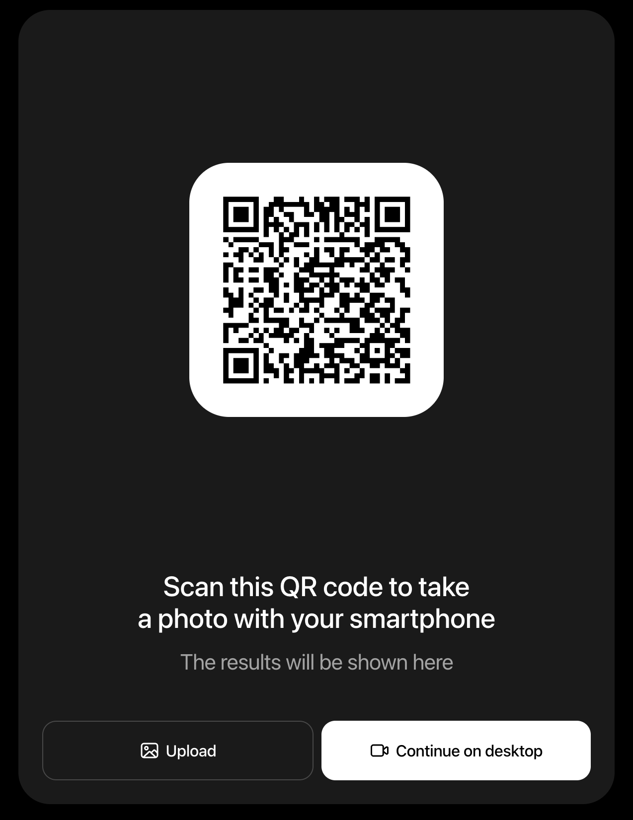
Use these selectors to customize the 2-device flow screens:
css
/* Companion source CSS selectors */
.companion .qr-code {
  color: #000; /* QR-code color */
  background-color: #fff; /* QR-code background color */
}
/* Refresh QR-code button */
.companion .qr-code button {}
/* QR code image */
.companion .qr-code img {}

/* Upload progress bar shown during companion transfer */
.companion .upload-progress {}

/* Camera permission prompt screen */
.companion .camera-permission-prompt {}
/* Prompt icon container */
.companion .camera-permission-prompt .icon-container {}
/* Prompt title */
.companion .camera-permission-prompt h2 {}
/* Prompt description */
.companion .camera-permission-prompt p {}

/* Camera permission denied screen */
.companion .camera-permission-denied {}
/* Permission denied icon container */
.companion .camera-permission-denied .icon-container {}
/* Permission denied icon */
.companion .camera-permission-denied .icon {}
/* Permission denied message headline */
.companion .camera-permission-denied h2 {}
/* Permission denied description */
.companion .camera-permission-denied p {}
/* QR code */
.companion .camera-permission-denied .qr-code {}
/* QR code image */
.companion .camera-permission-denied .qr-code img {}
/* Refresh QR-code button */
.companion .camera-permission-denied .qr-code button {}
/* QR code title */
.companion .camera-permission-denied h3 {}
/* Separator below QR code */
.companion .camera-permission-denied .separator {}
/* Controls container below QR code */
.companion .camera-permission-denied .controls {}
/* Buttons below QR code */
.companion .camera-permission-denied .controls .button {}Screen: Live Video
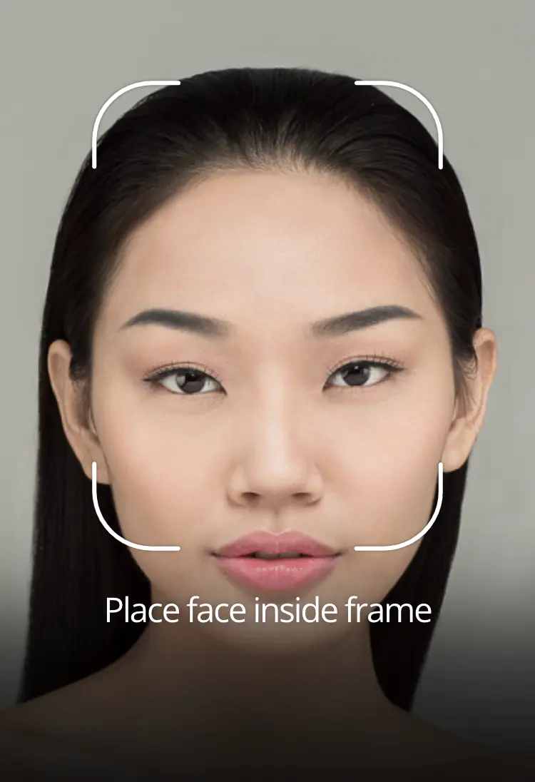
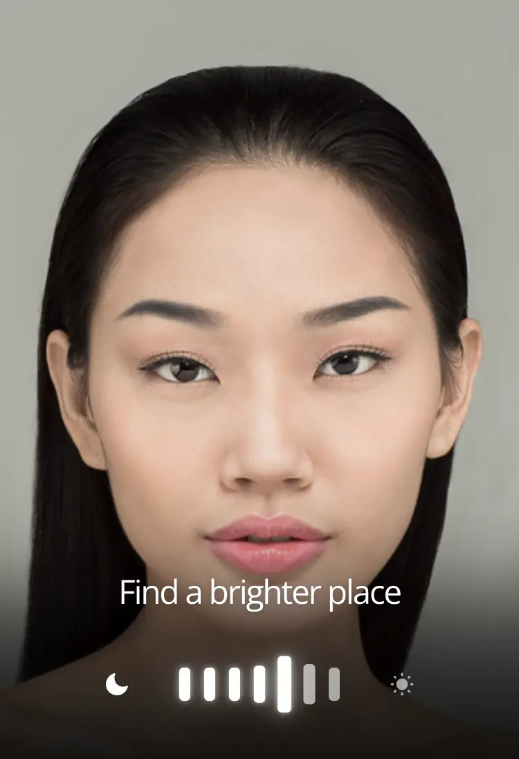
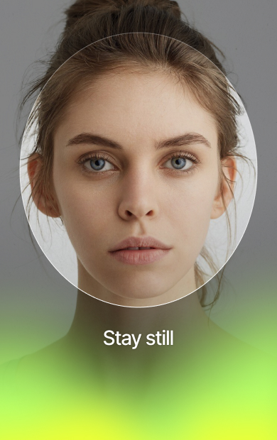
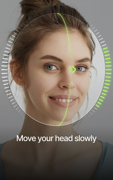
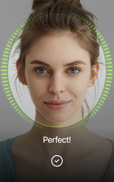
This screen is displayed during the AR session with video captured from the device camera. The active UI elements depend on the selected preset and image sources.

These CSS selectors can be used to safely customize the appearance of this screen:
css
/* Screen‘s class name */
.live-video {}
/* "Camera Switch" button */
.live-video .button.camera-switch {}
/* "Camera Switch" button icon */
.live-video .button.camera-switch .icon {}
/* Title ("Place face inside frame", etc.) */
.live-video .guidance {}
/* Countdown ("hair" and "face" presets only) */
.live-video .countdown {}
/* Left icon of the Illumination Intensity indicator (meter) */
.live-video .illumination-meter .icon-illumination-low {}
/* Right icon of the Illumination Intensity indicator (meter) */
.live-video .illumination-meter .icon-illumination-optimum {}
/* Illumination Direction indicator (compass) */
.live-video .illumination-compass-v2 {}
/* Illumination Direction indicator (compass) for Back Camera UI */
.live-video .illumination-compass-back-v2 {}
/* Face angle deviation guide with the direction indicator (curved line and left/right arrow) */
.live-video .angle-deviation-guide {}
/* Camera frame's corner radius and color */
.live-video .camera-frame rect {}

/** Face-180 selectors */
/* Face rotation guide with the direction indicator (curved line and left/right arrow) */
.live-video .rotation-guide {}
/* Face rotation progress indicator on the sides of the frame */
.live-video .rotation-progress-indicator {}
/* Status backlight for successful checks/captures */
.live-video .status-backlight-success {}
/* Status backlight for any bad state (such as wrong face angle) */
.live-video .status-backlight-error {}Screen: Image Review
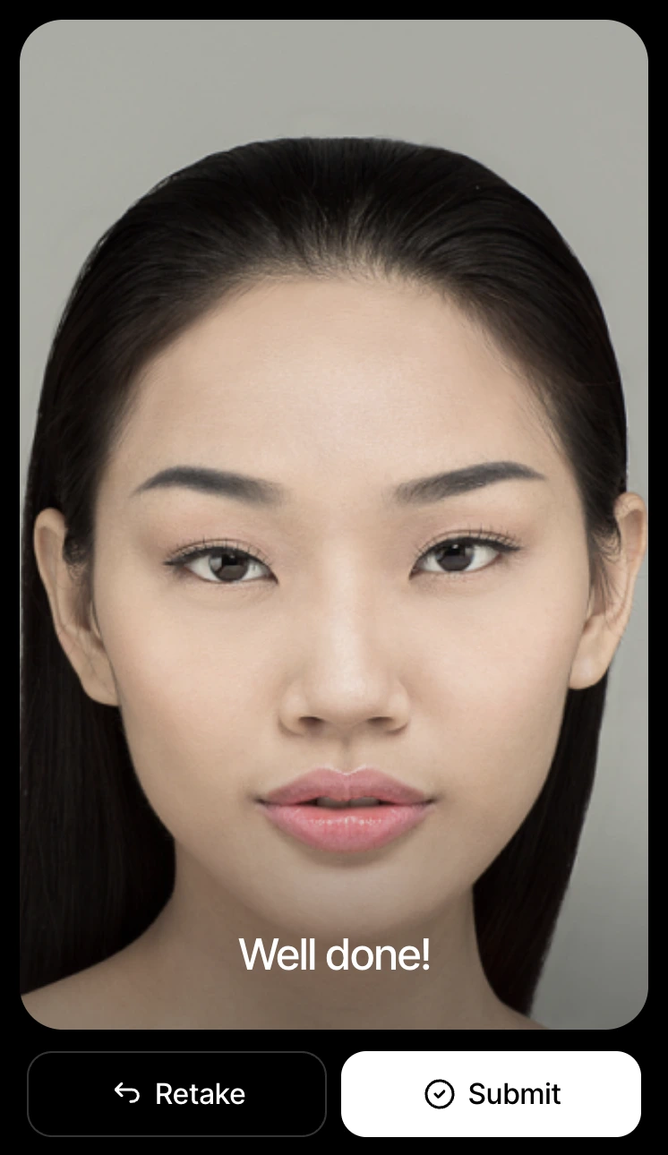
This screen is displayed after the image is collected and the end-user is reviewing the captured image.
These CSS selectors can be used to safely customize the appearance of this screen:
css
/* Screen‘s class name */
.preview {}
/* Title ("Well done") */
.preview p {}
/* Primary button */
.preview .button {}
/* Primary button icon */
.preview .button .icon {}
/* Secondary button */
.preview .button.secondary {}
/* Secondary button icon */
.preview .button.secondary .icon {}Screen: Error
This screen is displayed if something goes wrong during the session. 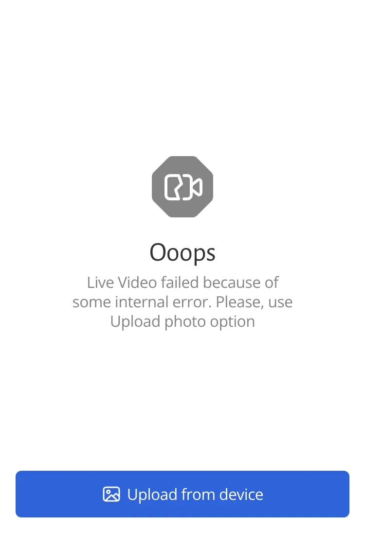
These CSS selectors can be used to safely customize the appearance of this screen:
css
/* Screen‘s class name */
.video-error {}
/* Illustrative icon */
.video-error .icon-video-error {}
/* Title ("Ooops") */
.video-error h2 {}
/* Text */
.video-error p {}
/* Button */
.video-error .button {}
/* Button icon */
.video-error .button .icon {}Screen: Tutorial
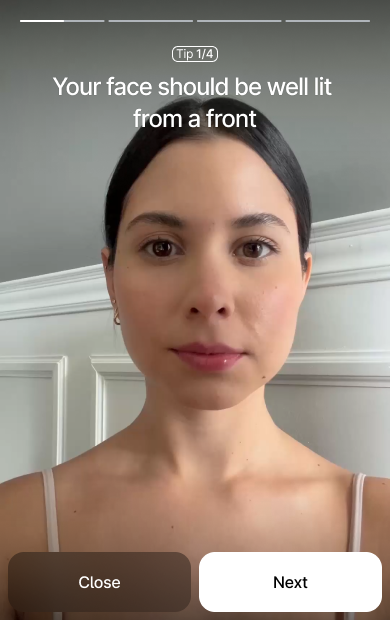
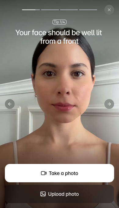
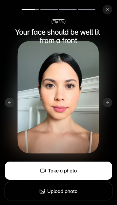
This screen helps the end-user understand how to position themselves and prepare for the photo capture by showing short video clips or images with instructions. See Tutorial for user-flow setup options.
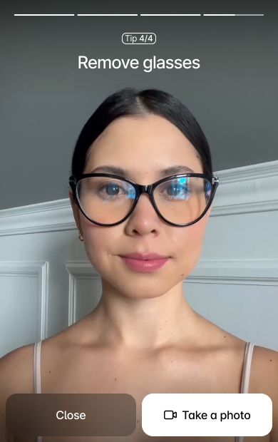
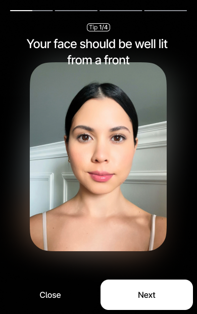
These CSS selectors can be used to customize the appearance of this screen. Note that all elements are wrapped in the .tutorial container, so you can scope your overrides safely:
css
/* Screen’s container element */
.tutorial {}
/* Header container (contains progress, tip and hint elements) */
.tutorial header {}
/* The top progress bar */
.tutorial .progress {}
/* The text tip with step count (e.g. "Step 1 of 4") */
.tutorial .tip .step {}
/* The main hint text below the Tip */
.tutorial .hint {}
/* Container holding "Close" and "Next/Take Photo" buttons */
.tutorial .controls {}
/* The "Close" button */
.tutorial .controls .close {}
/* The "Next" or "Take Photo" button */
.tutorial .controls .next {}
/* Icon inside the "Take Photo" button */
.tutorial .controls .icon-take-photo {}
/* Image displayed on the screen when tutorial option is set to 'image' */
.tutorial .image {}
/* A background layer behind the main image when tutorial option is set to 'image' */
.tutorial .image-backdrop {}

/* Step-specific selector to allow per-tutorial-step customization (combine it with the selectors above). Starts from 1 */
.tutorial[data-tutorial-step=n] {}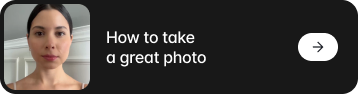
css
/* The main banner button */
.tutorial-banner {}
/* The preview image on the left */
.tutorial-banner img {}
/* Text and icon container */
.tutorial-banner .section {}
/* The main text element */
.tutorial-banner .text {}
/* The arrow icon container at the end of the block */
.tutorial-banner .icon-container {}
/* The arrow icon */
.tutorial-banner .icon {}Screen: Tutorial with Source Selection
This variant appears when entry-point is set to tutorial-alt, so the tutorial is shown immediately inside the Source Selection flow. It keeps the same structure and selectors as the regular Tutorial screen, but is embedded alongside source selection controls.
The mobile variant keeps full-height content with the tutorial stacked above the source buttons.
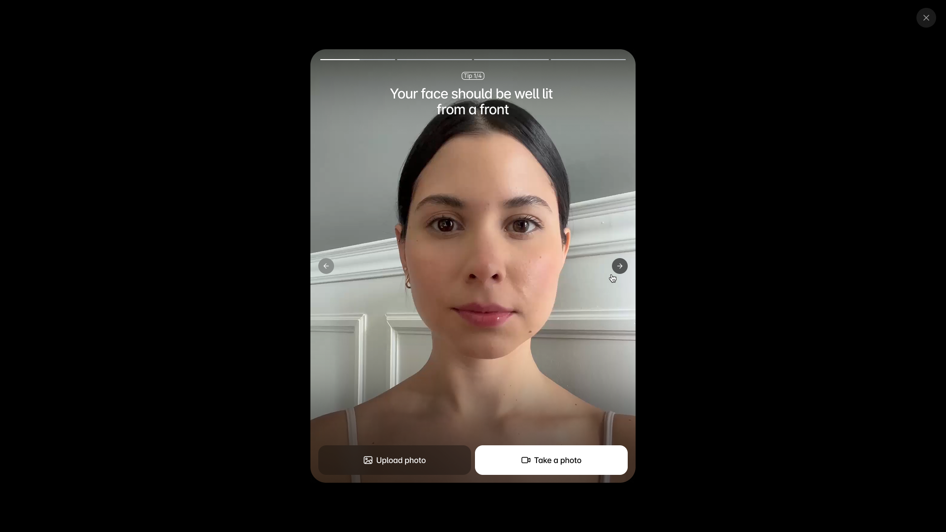
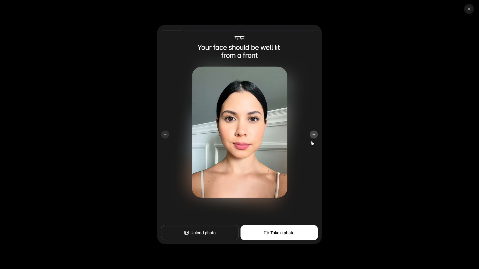
On desktop the tutorial is framed and centered while source controls sit below, matching the standalone tutorial layout.
The same selectors from Tutorial apply here. For the alternative tutorial shown directly on the Source Selection screen, you can also style navigation arrows and the desktop frame:
css
.tutorial .scroll-control.left {}
.tutorial .scroll-control.right {}
.tutorial .frame-container {}Restricted CSS Selectors
Usage of any CSS selectors that are not listed above should be avoided in your custom styles.
Do not use: Functional UI Elements Selectors
Examples: .success, .backlayer, .absolute, .h-full, .left-1/2 and all not listed above human-readable selector names.
WARNING
These CSS selectors are for internal use only. They belong to the functional UI elements that are not recommended to be modified as changing their appearance will break the end-user‘s experience.
Please, avoid using these CSS selectors. They might be changed or removed at all.
Do not use: Hash-looking CSS Selectors
Example: .k1eoapsl (or similar).
DANGER
These CSS selectors are auto-generated and change over LIQA releases. Following the LIQA release policy, they might change unexpectedly.
Please, avoid using these CSS selectors.
Explore Default Styles via DevTools
To learn the default LIQA styles for any CSS selector, inspect the <hautai-liqa /> element via DevTools via Google Chrome‘s DevTools:
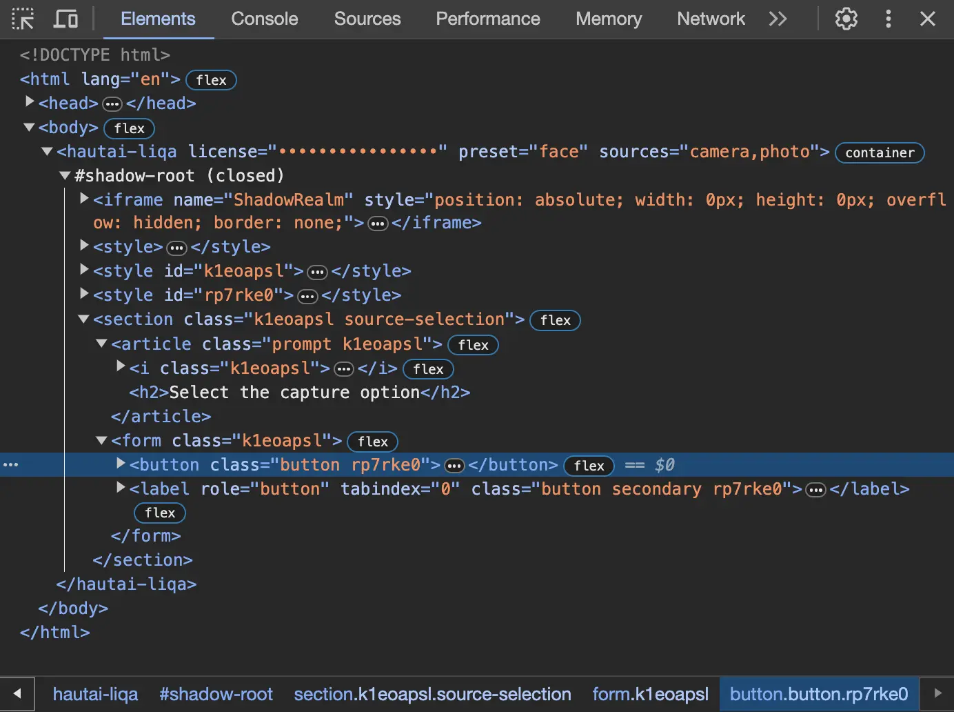
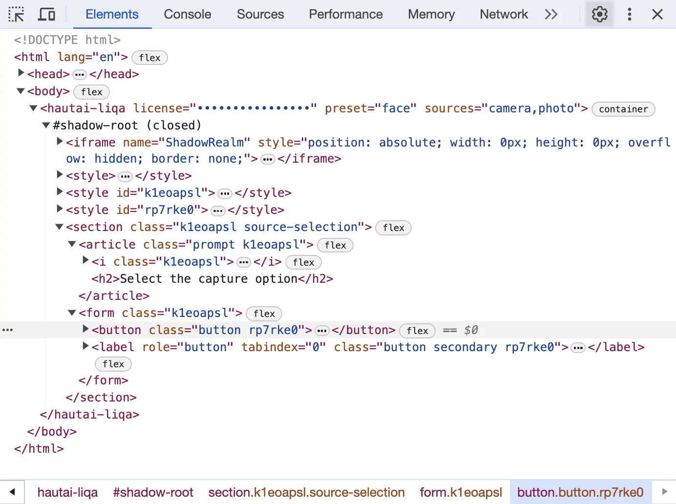
Inspection process
- Find the
<hautai-liqa />element under the Elements tab. - Expand its nested nodes to explore the CSS selectors. Please, refer to the recommended CSS selectors section above to learn about the CSS selectors that can be used to customize the UI.
- Investigate their default CSS properties.
Need Help?
Missing any UI elements in the recommended options?
To add UI elements to the recommended CSS selectors list, please, contact Haut.AI Support Team with this request via the Support Desk.
Need guidance on how to safely customize the UI?
To get guidance on how to safely customize the UI, please, contact Haut.AI Support Team via the Support Desk.